Our Favorite Fall Color Schemes for 2022
As Autumn rolls in, the fall foliage finally starts to arrive and those luscious summer greens turn to hues of gold, orange and deep reds. We are here to embrace the cozy earth tones and welcome a new season of comfort for your inviting exterior sanctuary. If you are painting your home before winter arrives, the fall colors may inspire your paint color choices. To help you with your fall color inspiration, we tapped our professional color consultant, Lexi, to dish out her favorite fall color schemes for 2022.
Here are our top four fall exterior color schemes we are loving in 2022:
Fall Color Scheme #1
If you want a medium brown for the body of your home, Nuthatch SW 6088 is a perfect choice. It is a grounding color that represents stability. It pairs beautifully with a deep brown roof for just the right amount of contrast. Since Nuthatch is a rich brown we want to brighten up the trim to add some interest to your color scheme.
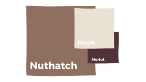
We chose Nacre SW 6154, which is an off white with a tinge of greige as the undertone. As for accent color, we love a dramatic front door. For lovers of rich colors that pop, Merlot SW 2704 for you. Merlot is a deep purple with undertones of deep red. This color makes us want to cozy up right by a fire with our favorite book! This color palette is inviting and will be sure to bring you depth and happiness.
Fall Color Scheme #2
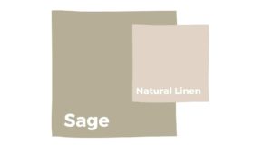
We are always here for a cool, earthy green to compliment the fall shades of gold, browns, and reds. We chose Sage SW 2860 out of Sherwin Williams Historic Collection. Sage is forever a timeless look. Sage represents wisdom, harmony, and nature.
Let’s add a little contrast and lighten up the trim with Natural Linen SW 9109. Natural Linen is a neutral that can almost look white when the sunlight hits it. Natural Linen is the perfect happy medium because it’s not too stark (like a true white) and not too warm, so it doesn’t look washed out. It’s polite without being too overpowering. We love it because it’s not overly saturated with green, yet muted down with the perfect amount of gray and a splash of yellow.
Fall Color Scheme #3
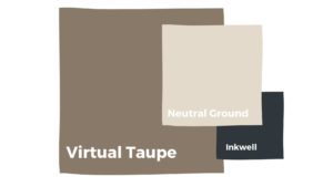
As we continue to see darker exterior paint colors trending this year, richer, deeper hues of browns are getting utilized. We love Virtual Taupe SW 7039 for its mixture of warmth and coolness. It is a medium brown with green and gray undertones that would pair perfectly with a lighter, neutral stone on your home. We chose Neutral Ground SW 7568 to help balance the robustness of Virtual Taupe. Neutral Ground SW 7568, just as it says in the title, is a neutral off white that can even be considered a greige.
Now for the accent, we are obsessed with Inkwell SW 6992. It is not your average black because it has undertones of a moody blue. Once you get up close and the light hits just right, you will see what we are talking about. We always encourage a strong front door, as it is the gateway to your beautiful home. We love Polished Mahogany SW 2838. It is a sophisticated and elegant color, and happens to also be in the Sherwin Williams Historic Collection. It is sure to be a showstopper that represents strength. If you are unable to get a natural mahogany door, we recommend this luxurious color to fill the gap.
Fall Color Scheme #4
To round out our list, we give you one of our favorite fall-inspired color schemes… Shiitake SW 9173 remains a favorite body color. It feels grounded, organic, and peaceful. It is a perfect neutral that can do both gray and beige. To give Shiitake contrast we chose a classic trim color, Creamy SW 7012. Creamy is great because it doesn’t have an overbearing yellowish undertone and it’s not too cool, which means it won’t create too much contrast. It’s smooth, silky, and here to be seen.
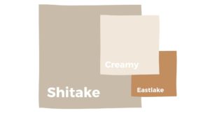
We chose Eastlake Gold SW 0009 for our front door accent color. It reminds us of a golden maple leaf that is not too saturated and not too dull– it hits just right, creating a cohesive flow for your favorite place! Golden hues create a feeling of divinity, luxury, and a warm welcome.
Best Fall Paint Color Schemes
Please keep in mind that there can be some changes to paint colors when applied. Virtual colors appear different, which is why we always recommend testing your colors, either by getting test samples or using a service like samplize (peel and stick samples). It’s always a great idea to see your colors on your exterior or in your interior space so you can see how they appear in different lighting.
We hope that these palettes will help keep you connected to Mother Earth with grace and style. The fun thing about these color schemes is you can always mix and match. They are everlasting and will remain versatile. Be sure to follow our Instagram for more ideas and color trends!
If you are needing Exterior Painting services in Denver, you can submit for a Free Estimate HERE. And if you need help with color selections, one of our talented Color Consultants would be more than happy to assist you.

