Cabinet painting is one of the easiest, most cost-effective ways to give your kitchen a fresh, updated look. But choosing the perfect kitchen cabinet color can be tricky. If you’re ready to elevate your space and want something that feels bold yet modern, 2024 has exciting trends to offer.
If you’re searching for “cabinet painters near me” to help you transform your kitchen cabinets, reach out to Kind Home Painting – Denver’s premiere cabinet painters in the Denver area.
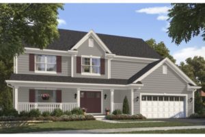
This year, we’re seeing a shift from classic white kitchen cabinets to black kitchen cabinets or dark, luxurious hues that exude sophistication and warmth. Keep reading for our top picks for dark kitchen cabinet colors in 2024!
Our top suggestions for trending dark kitchen cabinet colors
1. Iron Ore SW 7069
First on our list is the timeless Iron Ore from Sherwin Williams. A softer alternative to standard black kitchen cabinets, this charcoal hue offers depth and richness with its gray undertones.
A favorite among our Colorado clients, Iron Ore brings a sense of modern elegance to any kitchen. Its versatility allows it to pair beautifully with both warm and cool elements, making it a go-to for various kitchen cabinet styles.
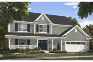
2. Sealskin SW 7675
For those drawn to the boldness of black, but seeking a more earthy tone, Sealskin is the perfect choice. This deep, rich chocolate shade, with a hint of gray, adds a grounded feel to kitchen cabinets.
The subtle gray undertones prevent it from feeling too warm or dated, making it an excellent match for countertops in red, brown, or cream tones. Sealskin creates a natural yet contemporary aesthetic – the perfect kitchen cabinet color for modern homes.
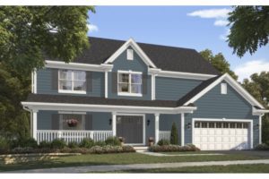
3. Dark Night SW 6237
Want to experiment with dark cabinet colors without going all-in on a black cabinet color? Try Dark Night, a deep blue-green that adds a pop of color while maintaining inky depth. This sophisticated shade works wonders when paired with white countertops and backsplashes, letting the color truly shine.
For added interest, try two-toned cabinets: Dark Night on the lower cabinets and a light neutral like Gossamer Veil SW 9165 on the uppers for a balanced, eye-catching look.
4. Outerspace SW 6251
If you love the idea of a gray-blue kitchen, Outerspace strikes the perfect balance. This rich blue with strong gray undertones feels refined and sleek, enhancing cooler-toned features in your home.
It’s a fantastic choice if your kitchen has cooler-colored floors or countertops. Outerspace feels timeless and clean, adding sophistication without overpowering the space.
5. Shadegrown SW 6188
Green cabinets have been having a major moment, and Shadegrown offers the perfect earthy, trendy option for 2024. This deep green cabinet shade, with its subtle warm undertones, invites nature inside, making your kitchen feel vibrant and fresh.
Depending on your lighting, it can even brighten your space, especially when paired with warm-toned countertops and backsplash for a cozy, natural look.
Pro Tips for Dark Kitchen Cabinet Colors
Dark kitchen cabinet colors make a bold statement, but can require a little extra care. To keep your kitchen looking its best, avoid matte finishes, which can make smudges more noticeable.
Instead, opt for a satin or semi-gloss finish for easier upkeep. And remember, it’s always better to choose a kitchen cabinet color that feels authentic to your style rather than one that’s simply trendy.
Ready to make a bold move with your cabinets? These deep, rich tones are sure to elevate your kitchen’s look. For more tips and inspiration, including stunning before-and-afters, follow us on Instagram. Or contact us today to transform your kitchen cabinets!
With endless paint colors to choose from, it can be difficult to nail down the right colors when painting your cabinets. The first place to start is with the product you are going to use. Benjamin Moore has a plethora of great colors to choose from, so we put together a list of the Top 10 Benjamin Moore Cabinet Colors for 2024.
The following list contains some of the options that our in-house Color Designers have seen gain some popularity in 2024.
Our List of Top Benjamin Moore Cabinet Paint Colors:
White Dove (OC-17)
Description: White Dove is a soft, warm white that remains a perennial favorite due to its versatility and classic appeal.
Why It’s Popular: This color is time-tested and beloved for a good reason. While we love to see bold, colorful cabinets, having a classic white on hand is essential. White Dove knocks it out of the park every time, offering a clean, sophisticated look that works well with various styles and color schemes. Its warmth and subtlety make it perfect for any kitchen, providing a timeless backdrop that complements any decor.
Hale Navy (HC-154)
Description: With a deep, rich hue, Hale Navy is a blue that adds a touch of elegance and drama to any kitchen.
Why It’s Popular: We’re not sure there will ever be a time when we don’t recommend Hale Navy. It’s a color we’ve loved for ages—go back and look at our blogs from seven years ago, and it’s there! Hale Navy is what all navy paint colors aspire to be. It’s dramatic, rich, and regal in a way that elevates your cabinets and feels classically American. It’s also an excellent option for two-toned cabinets. We typically recommend using the darkest or boldest color on the bottom and a more neutral color on top, as this tends to draw the eye upward.
Chelsea Gray (HC-168)
Description: Chelsea Gray is a warm, mid-tone gray with subtle green undertones.
Why It’s Popular: Grays never go out of style, but we are loving grays in 2024 that have a bit more warmth to them. Chelsea Gray is another time-tested classic from Benjamin Moore, shining for its dynamic appearance. It has a brown-violet undertone with a touch of green, which means it can look different under various lighting conditions. Dynamic neutrals like this are great in spaces like kitchens, which often have many permanent features you’ll need to coordinate your color with.
If you need further help selecting your cabinet paint colors, you can give us a call at (720) 637-4805 to set up a consultation with one of our Color Designers. Alternatively, you can fill out this form HEREand a team member will connect with you within one business day.
Regent Green (2136-20)
Description: Regent Green is a tranquil, deeply hued green with a touch of gray.
Why It’s Popular: While many of us are still captivated by Dakota Johnson’s iconic green kitchen, the trend for green cabinetry shows no signs of fading. Regent Green delivers on every level—grounded and slightly cool-toned, this shade exudes a rich, earthy quality reminiscent of a foggy morning in the forest. It’s as if you can almost smell the pines, bringing a touch of nature’s tranquility into your kitchen.
Blue Nova (825)
Description: Blue Nova is a bold, vibrant blend of blue and violet, chosen as Benjamin Moore’s Color of the Year 2024.
Why It’s Popular: If you’re seeking a truly trendy color that stands out, Blue Nova is a captivating choice. Much like how millennial pink had its time to shine, this stunning medium violet-blue is making waves in the design world. It’s a bit of a wildcard but works beautifully in well-lit spaces. Blue Nova is bold yet not overpowering, striking the perfect balance between vividness and subtlety. Its unique hue even brings to mind the excitement of a Stanley Cup victory celebration. This color is for those who dare to be stylish and sophisticated without following the conventional path.
Newburyport Blue (HC-155)
Description: Newburyport is a cool, coastal blue that adds a beachy, relaxed vibe to kitchens.
Why It’s Popular: Blue is a crowd favorite when it comes to selecting paint colors for many of our clients, but it can be frustrating if everyone’s kitchen starts to look and feel the same. A great way to choose a color you like (like blue) but make it interesting is to select a blue that has a bit of an interesting undertone. Newburyport Blue has a slight green undertone, which isn’t groundbreaking, but it takes it one step beyond a classic navy. This naturally teases the eye and feels way more interesting to look at.
Oxford Gray (2128-40)
Description: Oxford Gray is a sophisticated blue-gray that offers a tailored, elegant look.
Why It’s Popular: If you have been searching for the perfect gray-blue, then look no further than Oxford Gray. It feels very contemporary by adding color that feels soft and muted. This is a far cry from the drama some of the other blues on this list bring to a space. This feels airy and fresh without screaming for attention.
Classic Gray (OC-23)
Description: Classic Gray is an ultra-light shade of gray that can also function as an off-white.
Why It’s Popular: Sometimes they just nail the name of a paint color, and Classic Gray is just that. We’ve already mentioned that 2024 and the past few years have seen a significant shift toward warmer-leaning grays, and this is a warm gray. That being said, if you’re worried about Classic Gray looking beige, don’t be. That added warmth is just enough to lend dimension to the color. Though if you compare it to a cool-toned gray, you will absolutely see a difference. Warmer-toned grays are great because they feel less fussy and more welcoming, and this neutral is perfect for kitchen cabinets.
Onyx (2133-10)
Description: Onyxis a bold, charcoal black that stands out in any space.
Why It’s Popular: Is this color for everyone? No. But is it for someone? Definitely! A bold paint color choice is not for the faint of heart, but with the number of all-black exteriors we saw last year, it’s no surprise that this dramatic hue is making its way inside as well. Imagine Onyx cabinets with butcher block or cement countertops…or white countertops. Kitchens are historically spaces where people congregate, and black cabinets are the perfect conversation piece because you’re not like other homeowners; you’re cool homeowners.
French Toile (1440)
Description: French Toile is a mid-toned gray-blue that offers a serene, calming effect.
Why It’s Popular: Does this color sound like “French toilet”? Maybe, but that’s beside the point because this color is stunning! Much more of a dreamy blue-gray that feels super subtle and sophisticated—as any color called French Toile ought to be. This color is perfect with lighter wood floors and bright spaces.
These colors reflect the latest trends and offer a range of options to suit various kitchen styles and preferences. Whether you’re looking for something bold and dramatic or clean and classic, these Benjamin Moore colors are excellent choices for kitchen cabinets.
At Kind Home Painting, we believe in giving back to the community and supporting local organizations that make a significant impact. Recently, we had the incredible opportunity to work with DIRT Coffee, a nonprofit dedicated to creating inclusive workspaces for the neurodivergent population. Their mission, “Divergent Inclusive Representation Transforms,” is about cultivating intentional work environments where neurodivergent individuals can gain meaningful, integrated, and equitable employment.
DIRT Coffee started as a mobile coffee truck in 2013 and has since expanded to two brick-and-mortar programming sites across the Denver Metro area. These sites employ, train, and empower neurodivergent individuals, helping them achieve greater independence and success.
The Paint Project
DIRT Coffee recently acquired a historic building in downtown Littleton, which required significant renovation, including a much-needed repainting. Having seen some of our previous work with local organizations like Hope House and A Precious Child, they reached out to us to see if we’d be interested in helping. One of our employees had previously worked with DIRT Coffee, so we were especially excited to jump at the chance to support their mission.
The Transformation
Transforming DIRT Coffee’s new home was no small feat. The project required nearly 30 gallons of paint and over 140 man-hours. Our team dedicated time and effort to ensure the historic building’s new look would reflect DIRT Coffee’s vibrant and inclusive brand. Here’s a breakdown of what we did:
Initial Assessment: We conducted a thorough assessment of the building to determine the best approach for the repainting project, taking into account the building’s historic features and the desired color scheme that aligns with DIRT Coffee’s branding.
Preparation: Proper preparation is key to a successful paint job. We carefully prepped the surfaces, ensuring any old paint was removed and the surfaces were ready for new paint.
Painting: Using the highest performing paint from Sherwin-Williams, our team meticulously painted the exterior and interior of the building. This high-quality paint was chosen for its durability and longevity, ensuring it will hold up better over time, especially as this space will be a commercial hub. The chosen colors were selected to reflect DIRT Coffee’s welcoming and inclusive environment, ensuring the space feels warm and inviting.
Finishing Touches: Attention to detail is crucial, especially for a historic building. We added finishing touches to ensure every aspect of the paint job was perfect, from trim work to final touch-ups.
Expanding Dirt Coffee’s Services and Impact
This new building and its renovation are not just about aesthetics; they are about expanding DIRT Coffee’s ability to offer even more services to help neurodivergent people thrive in the workplace. With the new space, DIRT can broaden its training programs and provide more employment opportunities, furthering their mission and making a greater impact on the community.
Why This Matters
Supporting organizations like DIRT Coffee is at the heart of what we do at Kind Home Painting. By transforming their new historic home in Littleton, we hope to contribute to their mission of empowering neurodivergent individuals. We believe that a beautifully painted environment can inspire and uplift, creating a space where employees and customers alike feel welcome and valued.
A Partnership Built on Shared Values
Our partnership with DIRT Coffee is a testament to the power of community and shared values. We are proud to support an organization that is making a real difference in the lives of neurodivergent individuals. By providing our painting services, we hope to help DIRT Coffee continue their important work in a space that truly represents their mission and values.
Looking Forward
As DIRT Coffee settles into their new home, we look forward to seeing the positive impact they will continue to make in the community. We are grateful for the opportunity to have played a part in their journey and are committed to supporting more local organizations in the future.
For more information about DIRT Coffee and their mission, visit theirwebsite. To learn more about our community projects and how we can help with your painting needs, contact us at Kind Home Painting.
By sharing this story, we hope to inspire others to get involved and support local organizations that are making a difference. At Kind Home Painting, we are dedicated to giving back and creating beautiful spaces that reflect the heart and soul of our community.
Our certified color consultants are available for all of our paint clients to help with the color selection process. Choosing paint colors can be a stressful affair, but working with a paint color professional can simplify the process and guide you to colors you will love. We currently have two consultants that you may work with, and although we pride ourselves on being flexible enough to meet any clients needs each designer certainly has a specific style.
Meet Lexi Thompson – Fresh, Funky, and Inspired
Lexi is our most senior color consultant and has been in the painting industry for over six years. She has a passion for making the paint color selection process fun and working with clients to find colors that inspire them and transform their space. Lexi uses her years of experience and loves pulling inspiration from vintage designs, artwork, and current trends to find colors that will “wow”.
What’s Lexi’s Color Signature?
A designer’s go-to colors are ever changing and evolving and Lexi is no exception. With that being said, she is known for introducing pops of color that draw the eye in and create a focal point. Whether on a front door, with an accented trim color, or even using colors in nontraditional ways, like bringing color up onto the ceiling, she is always looking for a way to surprise her clients and engage the eye.
Lexi particularly enjoys working on larger, more complex projects like our Denver Victorians or playful homes such as those within the mid-century modern realm. She appreciates the opportunity to collaborate with her clients to find fresh new ways to highlight the unique features of these homes while honoring the history of these designs.
Some of Lexi’s Favorite Paint Projects
Dynamic Accent Walls
Working with a client who isn’t afraid of embracing colors is always a joy. As a color consultant, Lexi loves to seize these opportunities. This particular client had a very eclectic style and wanted to make sure of a dynamic set of accent walls. When it comes to coordinating several colors together Lexi finds it’s helpful to choose a theme for the space. In this case, Lexi and our paint client went with a slightly retro desert inspired color palette.
The different use of each paint color brings an interesting contrast to the space while infusing it with personality. Although making use of several different colors can feel overwhelming it’s also a great way to create a lot of visual interest and keep the eye moving throughout a space.
Playful Pops of Paint Colors
This exterior was a ton of fun because the client was looking to brighten up their dark exterior and was hoping to add some playful pops of color. In order to accomplish this, they chose to go with an allover neutral for both the body and trim.
The use of Whitetail SW 7103 helped create a canvas for the brighter colors to really pop against without feeling out of place. Making your trim and body color the same paint color is also a great way to remove the visual business of trim. So if your home has a lot of trim and you’re not a fan, then this can be a great solution.
The client had a very particular vision for the shutters and front door that was inspired by mid-century homes as well as coastal elements. After much deliberation they chose to go with Waterfall from Sherwin Williams and Frolic SW 6703 on the front door. The strategic use of these colors and their placement work with the home to bring visual interest without making things too busy. The clients loves it and we couldn’t be happier with the transformation.
Melding Traditional Elements with Interesting Contrast
Victorians can be intimidating for both clients and color consultants and this beautiful Denver home was no exception. This client was itching to bring some fun color back into the intricate details of the home after years of beige. When you’re going from a very simple scheme to a much more complex scheme, it can be difficult to visualize the final product so digital mockups were a must for this client.
Even with a relatively small painting area we landed on a total of SIX colors for this exterior. Lexi and the Kind Home paint client chose to create harmony by sticking to a single color family that would contrast the current brick color. The detailed pattern adds a ton of visual interest to the front of the home and helps to honor the historical beauty and integrity of these Denver homes.
Meet Yasmine Kot – Earthy, Classic, and Grounded
Yasmine is a bit newer to the painting world, but she uses her years of experience in marketing to create engaging spaces that work seamlessly with the vision held by each of her clients. Yasmine tends to favor classic color schemes that are harmonious with the Colorado landscape while also finding ways to incorporate current trends in a way that feels intentional and timeless.
What’s Yasmine’s Paint Color Signature?
With color trends changing frequently it’s important for designers to stay on top of things so they can bring valid and thoughtful input to each project. Yasmine is known for her use of earth tones and dark dramatics to create warm, balanced spaces that you want to sink into. She is inspired by nature and strives to bring life into spaces, often with an unexpected twist. Yasmine loves a dark dramatic trim color, rich accent walls, and subtle contrast that creates an elevated and elegant finished look.
Interior transformations are a favorite of hers along with clients who are looking for traditional and timeless exterior schemes. Painting your brick can feel intimidating but the transformation can be absolutely jaw dropping with the right color choices. She is always considering the fixed features within a space and uses those to guide her color selection in an effort to create a perfect harmony and balance.
Some of Yasmine’s Favorite Homes
Unique Uses of Paint Color
Every now and then you get the opportunity to work with a paint client who really wants to go for something new and unique. This Englewood painting client loved the idea of stepping away from the typical white trim and after talking through quite a few options they landed on Dark Knight SW 6237. By choosing a deep, rich slate blue they were able to create a complimentary color scheme with the existing floor color.
Alternatively, the client was also excited to get rid of the blue in the dining room in favor some more earthy and grounded. Yasmine pulled inspiration from popular 1970’s colors and went with Mossy Gold, a very unique greenish brown that brings a lot of warmth to the space.
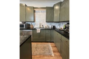
Grounded Earth Tones
Sometimes the biggest transformations can come from the simplest changes. This client was eager to revamp her kitchen and was aiming for something earthy and on trend. Green cabinets have been a massive paint color trend for 2023 and Yasmine and the client found the perfect shade with Sage Light Green from Sherwin Williams.
This gray green works so well with the existing backsplash and the updated gold hardware, absolutely transforming the space into the kitchen of our client’s dreams. We couldn’t be happier with how this turned out and feel green will continue to gain popularity amongst clients.
Classic Contemporary Exteriors
Painting your stucco is a great way to keep your home looking refreshed and maintained. When Yasmine met with this client they were really hoping to land on a modern yet timeless color scheme for the exterior and loved the lighter grays. With that in mind they chose Mindful Gray, a warmer light gray from Sherwin Williams and paired it with Snowbound for a crisp, sharp contrast between the body and trim.
The front door is Downing Slate, which is a popular choice amongst clients and adds to the contemporary feel of the home. Getting rid of all the warm yellows and browns really helped this home feel more current and the clients couldn’t be happier!
Benefits of a Professional Color Consultation
Everyone interprets colors differently, which means there are no “perfect paint colors”; however, working with a certified color designer can help remove stress and provide guidance to find colors that will work for your home. To best prepare for your color consultation we recommend looking for inspiration on Pinterest or around your neighborhood to get ideas. Some things to consider are:
Do you like high or low contrast between body and trim colors?
How do you want your space or home to feel? Examples might include clean, open, dramatic, warm, inviting, etc.
Are your fixed features (things you won’t be changing within the space) overall cool or warm in undertone?
Are there any color families or colors you would like to avoid?
Even when working with a color consultant it’s important that you bring your opinion and vision for the space to the conversation. Ultimately, you are the one that has to live with the colors and everyone has different preferences when it comes to colors they like or dislike. That being said, your home, the surrounding areas, and fixed features must be taken into consideration. These can be limiting factors when choosing paint colors, so it’s best to go into your appointment with an open mind.
If you feel like Lexi or Yasmine could help you narrow down your colors and provide some professional guidance, you can schedule a Color Consultation HERE
Finding the perfect paint colors for the exterior of your home is hard, but it’s even harder when you’re part of an HOA. HOAs, or Homeowners Associations, are great because they help protect the value of homes within the neighborhood and help create a cohesive feeling throughout the community. That being said, they can also be a pain to work with. Here are tips straight from your Colorado paint pros about how to submit your exterior paint colors to your HOA for approval along with a selection of popular HOA color schemes curated for you by our professional color consultants.
Before You Submit Colors to Your HOA
There are a few things you need to know before you’re ready to submit any colors to your HOA.
1. Check for Pre-Approved Colors
If you’re lucky enough to be part of an HOA with a list of pre-approved color schemes, then yay! Pre-approved colors can greatly improve your chances of approval and some HOAs don’t even require approval for pre-approved schemes! While pre-approved colors can limit your options, it will make the selection process much easier.
2. Ask About Their Specific Approval Process
Every HOA is different, so you’ll want to contact your specific HOA directly for details about their color approval process and requirements. Some HOAs require a submission fee and paint chips or color links, while others may require you to paint samples on your garage so they can be viewed before approving. It’s best to accommodate these steps as much as possible and work within your HOA’s guidelines. Othersies, you may wind up with any issues.
Note that you will most likely not be able to use colors that are too similar to your neighbors. Many HOAs value variation between each home. If you submit colors that are the same or similar to the neighbors on either side of your home or across the street, they will likely be denied and a waste of time.
3. Plan Accordingly
Most HOAs review color scheme submissions at a meeting together before they approve or deny your any paint colors. That means that the frequency of which your HOA meets could have a big impact on your project timeline. Here in Colorado, HOAs typically have 14-60 days for approval. Highlands Ranch, HRCA, is one of the fastest turn around times for color approvals with homeowners typically receiving approval within 1-2 weeks.
If your HOA requires more than a couple of weeks to approve colors then you’ll want to make sure you plan your paint project accordingly. It’s vital to make sure you have enough time to select colors, submit them, and get approval before any paint is purchased. Otherwise, this can create delays on your project and be costly to change.
HOA Friendly Color Schemes from Color Consultants
Exterior Color Scheme #1
Created using Sherwin Williams Color Snap Visualizer
In this color scheme we have a classic gray body with just a touch of warmth. We find this color scheme to be warm and inviting. Shoji White on the trim brings a nice contrast without feeling too sharp, and a deep red door helps everything feel grounded and harmonious.
Green saw a huge surge in popularity last year with Evergreen Fog being a favorite amongst homeowners. We’ve paired it here with Alabaster, which is a beautiful, bright white. Dark Night adds a dark, but subtle accent.
Blue is one of the most commonly requested colors for the exterior of homes. It’s also the most common favorite color in the world, so that makes perfect sense! Slate Tile is a stunning blue-gray that really gives you that punch of blue without looking cartoonish. We’ve paired it here with the crisp Pure White and have Peppercorn as a warm, grounding accent color.
This scheme is perfect for those of you who have a craftsman style home and want a traditional color scheme that doesn’t feel dated. Craftsman Brown is a nice neutral and when paired with Roycroft Bronze Green it feels like a classic Colorado color combination. We’ve rounded it out with Roycroft Copper Red which would make for a fantastic front door color, but please DO NOT use it on shutters as this can result in a clown-like appearance.
Gray never goes out of style and Grey Matters is a wonderful, middle of the road option that isn’t too warm or cool. To make sure this scheme didn’t end up feeling too warm, we paired it with classics like Pure White on the trim and Tricorn Black as the accent.
Fun fact–Tricorn Black is the absolute darkest black paint color available from widely available paint retailers!
Getting HOA Approval
What makes these schemes HOA friendly is that they are all neutrals, or based on earth tones, which is a huge trend for covenant controlled neighborhoods here in Colorado. If you need more inspiration we recommend driving around your own neighborhood to view other homes. This will help you get ideas for what you’d like to see on your own home. For more color tips and tricks be sure to follow us on Pinterest and Instagram where we post weekly!
If you need any further assistance with selecting colors, you can easily schedule an appointment with one of our certified Color Designers HERE. And if you’d like more information, feel free to give us a call at (720) 637-4805.
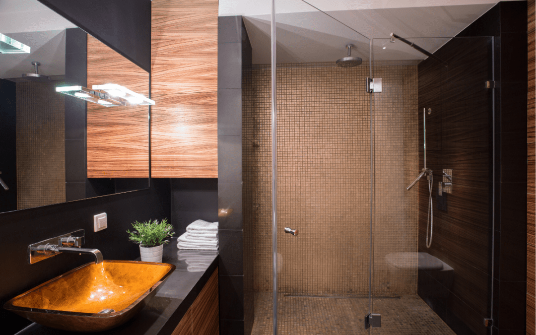
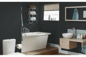
There’s just something fun about using dark paint colors to create a moody and dramatic space. They’re versatile in the sense that you can use a little to create a focal point or a lot to create an overall effect. Either way, dark, theatrical colors are a huge paint color trend for 2023. Bathrooms happen to be a great way to try out this trend without overcommitting. Keep reading to learn about our top 5 bathroom paint colors to try for dark, moody bathrooms in 2023.
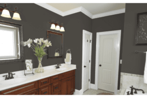
Urbane Bronze
Urbane Bronze is an incredible combination of black, gray, and brown. It’s beautiful on both exteriors and interiors and it’s a great way to ease into the dark paint color trend we’re seeing this year. It’s a very grounded color and pairs well with neutrals like tan or greige colors so it’s great for creating a sophisticated and tranquil space. For the largest impact, consider using Urbane Bronze on your bathroom walls, trim, and ceilings to create a cozy feeling that you’ll love spending time in.
Hale Navy HC-154
If you’re not quite ready to dive into the super dark paint colors, but you want to give this trend a try, check out Hale Navy. It’s a classic color from Benjamin Moore that has a huge fanbase. It’s a bit more modern than some traditional navy blues because it features a slightly gray undertone. The gray undertone really helps to ground the paint color. Hale Navy is beautiful on cabinets or walls and pairs really well with white trim for that crisp, clean contrast.
Greenblack 6994
For our bravest souls that love trying a new paint color trend we have Greenblack. This color is not subtle and is sure to bring that wow factor to your bathroom. The base is a cool black with a slightly green undertone and it works exceptionally well on walls and cabinetry. If it feels a little intense, consider doing just your cabinets or an accent wall to draw the eye and create a statement. When going with a black paint color, try to look for one that has some kind of undertone rather than a classic black because those undertones add a lot of personality and help the color feel much more dynamic within your space.
Dark Purple 2073-10
Some clients are really looking for a moody vibe that still feels romantic and inviting. Dark Purple from Benjamin Moore checks all of the boxes with a rich plum tone that brings a hint of mystery and glamour to any space. We love this for a bathroom because it’s not a color you see all of the time, so it will definitely stand out. This bathroom paint color pairs really well with white, black, or even tan countertops. So grab a sample and see if you feel like it works within your space.
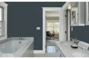
Mount Etna 7625
Blue is the most commonly requested color our designers receive, so we had to include a couple blue options. Mount Etna from Sherwin Williams is sure to stun with it’s slate gray base and subtle green undertones. It’s a very interesting and universally appealing color. Try this as an allover color or create a statement piece by painting your bathroom cabinets in this dramatic and moody paint color.
Painter for a Day
Bathrooms are a great way to test this paint color trend out because they’re small and often closed off from other spaces. So they are great for a unique color scheme without creating a lack of harmony with the rest of the house. However, it can be difficult to find a professional interior painter to help tackle a project this small. Most companies prioritize larger projects where they can make more money.
Here at Kind Home Painting Co. we’re committed to helping as many homeowners as possible to create the home and space they’ve been dreaming of. Since we understand how difficult it can be to find a painter for smaller paint projects we created our Painter for a Day program. This program offers straightforward, flat-rate pricing and a one-year warranty on all small painting projects. You can also add on a professional color consultation with a color designer to help you land on the perfect deep paint color that provides the impact you’re looking for. Use this link to request a complimentary estimate and get your project started today!