by Corey Morgan | Apr 7, 2023 | Interior Painting, Paint Color Help, Popular Colors
5 Bathroom Paint Colors for Dark, Moody Bathrooms
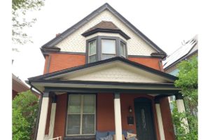
There’s just something fun about using dark paint colors to create a moody and dramatic space. They’re versatile in the sense that you can use a little to create a focal point or a lot to create an overall effect. Either way, dark, theatrical colors are a huge paint color trend for 2023. Bathrooms happen to be a great way to try out this trend without overcommitting. Keep reading to learn about our top 5 bathroom paint colors to try for dark, moody bathrooms in 2023.
Urbane Bronze
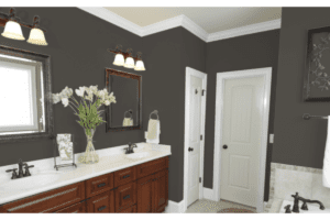
Urbane Bronze is an incredible combination of black, gray, and brown. It’s beautiful on both exteriors and interiors and it’s a great way to ease into the dark paint color trend we’re seeing this year. It’s a very grounded color and pairs well with neutrals like tan or greige colors so it’s great for creating a sophisticated and tranquil space. For the largest impact, consider using Urbane Bronze on your bathroom walls, trim, and ceilings to create a cozy feeling that you’ll love spending time in.
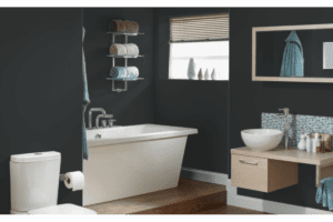
Hale Navy HC-154
If you’re not quite ready to dive into the super dark paint colors, but you want to give this trend a try, check out Hale Navy. It’s a classic color from Benjamin Moore that has a huge fanbase. It’s a bit more modern than some traditional navy blues because it features a slightly gray undertone. The gray undertone really helps to ground the paint color. Hale Navy is beautiful on cabinets or walls and pairs really well with white trim for that crisp, clean contrast.
Greenblack 6994
For our bravest souls that love trying a new paint color trend we have Greenblack. This color is not subtle and is sure to bring that wow factor to your bathroom. The base is a cool black with a slightly green undertone and it works exceptionally well on walls and cabinetry. If it feels a little intense, consider doing just your cabinets or an accent wall to draw the eye and create a statement. When going with a black paint color, try to look for one that has some kind of undertone rather than a classic black because those undertones add a lot of personality and help the color feel much more dynamic within your space.
Dark Purple 2073-10
Some clients are really looking for a moody vibe that still feels romantic and inviting. Dark Purple from Benjamin Moore checks all of the boxes with a rich plum tone that brings a hint of mystery and glamour to any space. We love this for a bathroom because it’s not a color you see all of the time, so it will definitely stand out. This bathroom paint color pairs really well with white, black, or even tan countertops. So grab a sample and see if you feel like it works within your space.
Mount Etna 7625
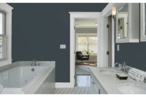
Blue is the most commonly requested color our designers receive, so we had to include a couple blue options. Mount Etna from Sherwin Williams is sure to stun with it’s slate gray base and subtle green undertones. It’s a very interesting and universally appealing color. Try this as an allover color or create a statement piece by painting your bathroom cabinets in this dramatic and moody paint color.
Painter for a Day
Bathrooms are a great way to test this paint color trend out because they’re small and often closed off from other spaces. So they are great for a unique color scheme without creating a lack of harmony with the rest of the house. However, it can be difficult to find a professional interior painter to help tackle a project this small. Most companies prioritize larger projects where they can make more money.
Here at Kind Home Painting Co. we’re committed to helping as many homeowners as possible to create the home and space they’ve been dreaming of. Since we understand how difficult it can be to find a painter for smaller paint projects we created our Painter for a Day program. This program offers straightforward, flat-rate pricing and a one-year warranty on all small painting projects. You can also add on a professional color consultation with a color designer to help you land on the perfect deep paint color that provides the impact you’re looking for. Use this link to request a complimentary estimate and get your project started today!
by Corey Morgan | Feb 2, 2023 | Color Consultations, Paint Color Help, Popular Colors
2022 Paint Color Round-Up
When it comes to painting, color may just be the toughest hurdle to overcome. As a professional Denver painter, we meet with our fair share of homeowners that struggle to find the right paint colors for their home. Looking back at popular paint color trends can often times be a good place to start.
This blog will hopefully offer some guidance as we reflect back on the most popular 2022 color trends. We’ll also make predictions for the 2023 paint season and give you an idea of where to begin on your own color journey. Let’s jump in!
White Paint Colors
Shoji White
Light Reflective Value (LRV): 74
Right off the bat, Sherwin Williams Shoji White has a lot going on. This particular color is a warmer white with yellow and a hint of red in its undertones. It has the potential to look beige, gray, and maybe even taupe in some conditions due to these undertones. In 2022, Shoji White was not the star of the show as whites go, but that is not to say that it’s a terrible color. Possibly better suited indoors, it can look a little washed out on the exterior of a home when paired with cooler features. For a similar warm white that reflects less sunlight outdoors consider Neutral Ground.

Snowbound
LRV: 83
Moving to the opposite end of the spectrum from Shoji White you will find Snowbound. This white has blue undertones galore. Many gravitate towards this color for the clean, sharpness it exudes. You often see this hue on both exterior and interior trim. This white is fairly universal, working with other cool colors extremely well and creating a sharp contrast when paired with a warm tone. Snowbound will continue to reign as the superior queen of cool whites in the new year. Other wonderful cool white options include Nebulous White and the tried and true, Pure White.
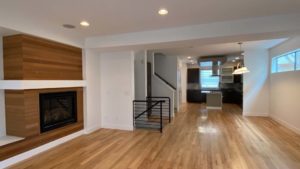
Interior painted in Snowbound
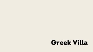
Greek Villa
LRV: 84
If you’re having a Goldilocks moment and are thinking to yourself, “Well Snowbound might just be too cool and Shoji is a little too warm…” Greek Villa may be your ‘just right’. It combines both blue and yellow undertones without compromising its brightness. This white seemed to top the charts for folks in 2022 achieving a best of both worlds appearance. We are sure to continue seeing this fresh, crisp color used on both exterior and interior projects.
Westhighland White
LRV: 86
The undertones in Westhighland White are soft, but yellow is certainly visible. This helps to steer away from a clinical feel and bring a coziness to the space. Similarly to Shoji, the creaminess in this color can make or break it for many people who are seeking out that clean-cut white. Other suggestions in this family that are more commonly chosen include Alabaster or Creamy as they offer that subtle warmth while still being bright.

Blue & Green Paint Colors
Gale Force
LRV: 6
Navy’s are an extremely popular choice when it comes to home exteriors and this particular shade of blue is a wonderful timeless option. Gale Force has a very low Light Reflective Value that may skew towards black in some light situations. However, I do not think that it’s ability to function well in many different situations is compromised by this detail. If this color family speaks to you, consider Naval or Outerspace for luxe, rich blues. These dark coastal navy’s, will continue to be high up on the list of popular exterior choices for 2023.

Evergreen Fog
LRV: 30
Evergreen Fog is a lovely mid-tone green hue and was our champion Color of the Year for 2022. It has also been incorporated into Sherwin’s 2023 Color Trends Palettes and I believe this shade is here to stay. Working beautifully into exterior and interior schemes, Evergreen Fog seems to tick all the boxes for those wanting to choose colors that are warm and earthy. This color works well to not overwhelm existing spaces with saturation, but also has enough oomph to create an accent easily and effortlessly. I am looking forward to seeing it continue to transform and beautify homes inside and out.

Denver exterior painted in Evergreen Fog
Other notable greens include Escape Gray and Pewter Green. Escape Gray offers a softer green hue than Evergreen Fog and incorporates gray into its undertones. On the other hand, if you want a more saturated green, consider Rookwood Dark Green to deliver more of a punch on your exterior or an interior accent wall.
Need help choosing paint colors? Click HERE to schedule a Color Consultation with one of our Certified Consultants today!
Gray Paint Colors
Peppercorn
LRV: 10
I can say for certain that when Peppercorn is mentioned to my fellow Color Consultants and me, we are quite excited! This hue is completely unique in that it combines blacks and browns like you would expect to see in the actual spice. There is an unusual depth and warmth to the color that is lost in other shades of black and dark gray. With that being said, this is absolutely going to be in the forecasts for 2023 projects. It functions well as both the main character and in a supporting role. It can be customized to work well over a wide span of design goals.

Dovetail
LRV: 26
Dovetail is a mid-tone greige with a good amount of warmth to it. The brown undertones here make it inviting and help to make this color applicable to many different projects. However, there are stronger contenders in the Sherwin Williams gray color sphere. These include Acier and Dorian Gray which are definite close relatives to Dovetail but less saturated making them a bit lighter on the eyes.
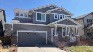
Exterior painted in Dovetail
Summit Gray
LRV: 30
Another mid-tone gray, Summit Gray, shows off more of a warm, purple undertone. It’s easy on the eyes and does not call too much attention to itself. That makes this color malleable to a variety of schemes and able to function both inside and outside well. Grays certainly top the list for exterior schemes as they feel modern and updated. Though warm tones are the big predictions for 2023, grays will absolutely make their way onto many homes this year. Other popular colors in this family are Tin Lizzie, Cityscape, and Grizzle Gray.

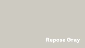
Repose Gray
LRV: 58
When talking about very light gray colors like Repose Gray, I find it to be even more crucial to view the color in many different lighting conditions. There have been clients in the past who have chosen a hue similar to this one only to be underwhelmed with its actual ‘grayness’. It other words, it appears closer to white. With Repose Gray’s high LRV, this can be expected that under intense light the tone reflects much more than anticipated and loses what little depth it had to begin with. Due to the unpredictable nature of colors like this, opt for grays with more saturation like Mindful Gray.
Beige Paint Colors
Kilim Beige
LRV: 57
Kilim Beige is often a great jumping off point when deciding on color in the beige family. This hue can be helpful in deciding whether you want to go lighter or darker with your scheme. It can also be the perfect mid-tone color for those wanting a warm tone without being so heavily brown. It feels modern, but also ages well. For a darker beige consider Antler Velvet. If Kilim Beige feels too dark to you, give Natural Linen a shot.
Exterior painted in Kilim Beige
Accessible Beige
LRV: 58
For a cool-toned beige, Accessible Beige is a solid option. Again, something to keep in mind is that this hue is very susceptible to appearing white or gray in intense light conditions due to its lightness. When I consider what people often look for in a beige, this is not the first color to come to mind. Accessible Beige is certainly light and airy, but to really make a contrast in most schemes, I would opt for a more saturated brown like Shiitake or Loggia.

I hope this 2022 recap is a helpful tool for your 2023 projects. As always, I encourage you to view your color choices with sample sheets or test quarts to consider under many different lighting conditions. This is the best way to make a comprehensive decision on what colors you love the most!
If you need help deciding on your colors, learn more about our comprehensive Color Consultations. And if you are in the market for a professional painter in the Denver area, give us a call at (720) 637-4805. You can also learn more about our paint services HERE. Thanks for reading!
by Corey Morgan | Dec 15, 2022 | Color Consultations, Paint Color Help, Popular Colors
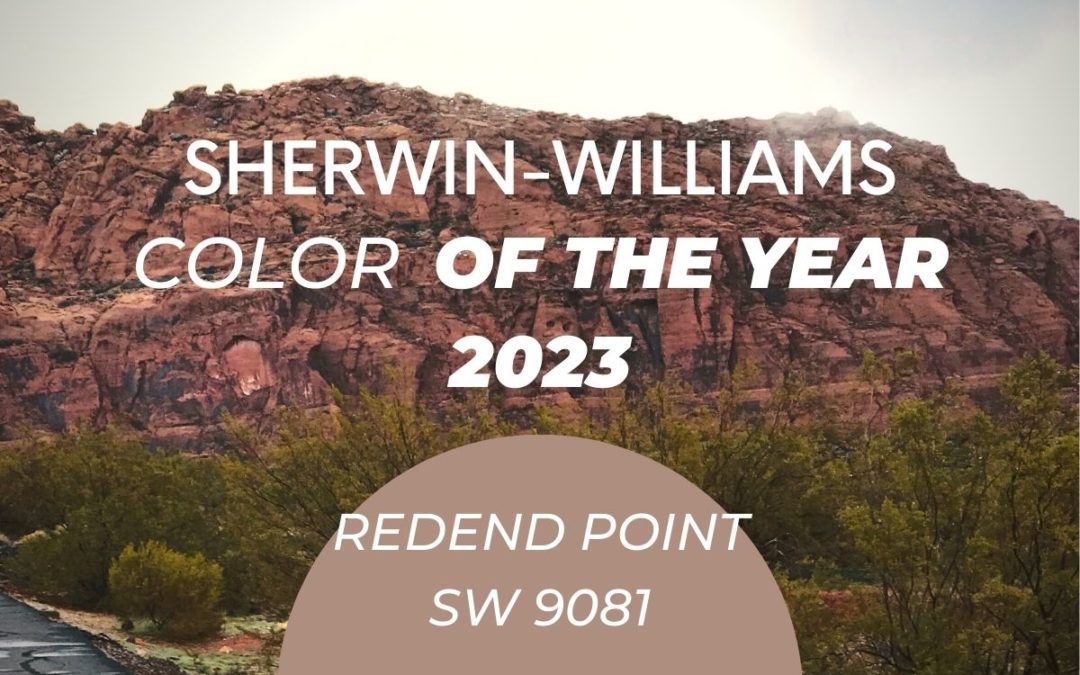
Sherwin Williams 2023 Color of the Year
Sherwin Williams 2023 Color of the Year is Redend Point! As 2022 comes to a close, we look to the new year and prepare for a season of healing, understanding, and unification. Sherwin Williams 2023 color of the year, Redend Point SW 9081, aligns well with these initiatives as it is all about personal wellbeing.
As a Denver exterior and interior painter, Kind Home Painting Company receives a lot of questions about the Sherwin Williams Color of the Year. You can find out if this years color is the right fit for you and your home by setting up a free painting estimate HERE.
Redend Point
Color can evoke feelings such as excitement, compassion and calmness. When thought is put into your paint color choices, it can reflect your best style and personality. Color is inspired by the things we wear, where we travel, the food we eat, the books we read, and the things we watch. Color has the ability to inspire, relax, and make you feel safe, yet playful. With such a great impact, it’s easy to see why color plays such an important role in our lives. As we reflect on the past year and what’s to come, Redend Point tells us that 2023 will be a year of rejuvenation and connection.
We were not surprised to see Sherwin Williams chose a neutral paint color, but admittedly we were a bit taken back by their choice. Redend Point SW 9081 is a medium beige with pink undertones. Redend Point is a lighter version of the red, orange Rockwood Terra Cotta SW 2803 that gained some popularity in 2022. When we look at this color we feel it embodies that effortless, earthy, free-spirited boho style. From a world traveler, to the rocky mountains, you can be sure to express your eclectic style through this neutral, earth toned hue.

Redend Point Exterior Painting
Redend Point also gives us southwest adobe vibes due to the raw clay-like coloring. We picture this type of exterior paint in desert climates where it can work with the natural landscape to blend in. Although we don’t anticipate this color being right for everyone, this earth-toned beige would work well as an exterior paint color on a stucco home. While Redend Point can work within the proper environment and neighborhood, we feel that it is best suited for interior spaces.
Redend Point Interior Painting
Your interior is sure to create some inspiration when visualizing this color in your home. Try Redend Point in a powder room, as an accent wall, in an office, child’s bedroom, or even your laundry room for a splash of color and change of pace. This color can really help any space feel cozy and welcoming.
When painting interiors, color gives you the ability to express yourself. When you add different color combinations it can provide an outlet to display your favorite treasures, trinkets, and memorabilia. You can complement any color with a textured rug, curtains, pottery, artwork, decor, and plants. We’d love to see this color paired with Sherwin Williams Rainstorm SW 6230 as an accent. You can create an impactful mood when mixing colors, but it must be done tastefully with many layers to harmonize mixed patterns and textures. This look is very on trend right now, so it’s a great way to venture out of the typical gray or white neutrals.
Whether your goal is to brighten up your space or make it feel more airy, you can neutralize Redend Point SW 9081 with different accents such as Ripe Olive SW 6209. We love the depth that Ripe Olive gives as it counteracts with the beige. The two colors really balance each other out. We also love the idea of using Sherwin Williams Polished Mahogany SW 2838 for added richness and a timeless look. The beautiful thing about painting is you can use your imagination and take risks. Remember, smaller spaces are perfect for trying out new colors. You can always change smaller accent walls and doors rather than painting your whole house again.
Cons of Redend Point
Some of the con’s we’ve heard about Redend is that this paint color looks similar to a beige band-aid. Remember, everyone sees color differently and there is no wrong or right answer here. It’s all about how the color makes you feel and how it pairs with your surroundings. You can do a variety of things to best balance the color without feeling too saturated or too bland. When considering this color we always encourage you to get actual paint samples.
Undertones and Paint Samples
Each paint color has undertones. When different lighting interacts with the paint it will pull out more of the undertones. This can change how it looks within a space. If you get actual paint samples from your local Sherwin Williams we suggest you paint the color on a big piece of posterboard. That way you can tape it up in a variety of places and see it in different light and surroundings.
Remember, lighting changes everything! In a North facing room your colors tend to look cooler and darker, while in a South facing room colors tend to look brighter. Light, shade, and different colored light bulbs will also affect your paint colors. Make sure to test your paint samples in different lighting to make sure you are happy with your colors!
Conclusion
Overall, Redend Point has the potential to bring some warmth and pep to your home. We think it is best suited for interiors, but can work well as an exterior paint given the right substrate and environment. This color pairs nicely with a variety of colors, so we think we will see some really creative uses of Sherwin Williams 2023 color of the year, Redend Point!
Be sure to like, subscribe, follow on our Instagram, Youtube channel, and Facebook for more home design tips. And if you are looking for more color help, be sure to check out Kind Home Painting Company’s Color Consultation services. Our Certified Color Consultants can help you best utilize Redend Point in your home! Thanks for reading!
by Corey Morgan | Sep 27, 2022 | Exterior Painting, Paint Color Help, Popular Colors
Most Popular White Paint Colors In 2022
If you’ve ever had the tedious task of selecting a white paint color then you know just how overwhelming it can be. You might think picking a white paint color would be simple, but Sherwin Williams alone has nearly 100 whites to choose from. That’s a whole lot of options so we put together this list of our most popular white paint colors in 2022 to help you narrow down your choices.
Alabaster
Starting off with a classic, Alabaster SW 7008 from Shewin Williams is tried and true. This is a very classic white that can be used on both interiors and exteriors. What we love about Alabaster is that it’s what would be considered a “true” white but it has a little bit of warmth in it. This helps it not feel too sharp or too cold. We always recommend this white color for clients that want a clean white to pair with natural elements or warmer features like brick, stone, and warm-toned roof shingles.
Alabaster SW 7008
Snowbound
If you like a little bit of a cooler look to your white, then you have to try Snowbound SW 7004. This is a perfect white to pair with cooler body colors like navy blue or the always popular blue gray. We particularly like to see this white used as a trim color on a home that does not have any brick or stone. It creates a clean, crisp finish that feels contemporary and bright.
Snowbound SW 7004
Pacer White
Pacer White SW 6098 is a newer addition to our most popular whites, but clients can’t seem to get enough of it. Pacer White is great for both body or trim colors and it brings a softer finish to the overall look. We really love to see this paired with other warm colors like greiges and taupes, because it adds contrast without sharpness. Pacer White does have a slightly yellow undertone, so if you want something a bit more modern then check out some of our other options below.
Pacer White SW 6098
Panda White
This is another great option to consider if you’re looking for a white body color. Panda White SW 6147 is quite similar to Pacer White, but has less yellow undertones and more of a red undertone. This helps bring a lot of warmth to the color scheme. We love to see this paired with a darker trim like Black Fox SW 7020. It’s a great way to achieve the modern farmhouse look without using a stark black and white color combination. Warmer tones like this make your home feel more welcoming and approachable.
Nacre
If you have red brick then you absolutely must consider Nacre SW 6154 as a possible trim color. We recommend this beautiful Sherwin Williams color constantly for our clients who have a predominantly warm red brick home; it can create a wonderful contrast without the sharpness of a white like Alabaster. The warmth of Nacre works harmoniously with the red brick to establish a unified and timeless look.
Shoji White
Looking for a modern and contemporary white that isn’t too warm or too cool? Shoji White SW 7042 is the perfect white for you then! Shoji has held it’s popularity for the last few years and we don’t see any signs of it slowing down anytime soon. This is a great option for both interiors and exteriors and is most commonly used as a body or wall color. It has a touch of warmth, and a slight touch of gray, which makes it feel very dynamic and allows it to work in a variety of spaces with many different features.
Shoji White SW 7042
How to Choose the Perfect White Paint Color
Our best advice when it comes to white is don’t play it safe. We see a lot of clients who take the easy way out and just ask for a “stock white”. Although these do exist, and in a pinch can be a great option, the whites with a little more pigment and dimension will provide better coverage. Plus, they’ll look more intentional and sophisticated. White colors do not have to be boring and choosing the right white paint color for your exterior or interior painting project can create a very interesting overall look. As always, we do recommend you pick up some samples to test your paint out before beginning your project.
For more color inspiration, be sure to check out our Instagram. If you are struggling to find the right color for your project, we suggest you read a little more about Color Consultations HERE. One of our talented Color Consultants would be more that happy to assist you in choosing your colors!
by Corey Morgan | Jul 28, 2022 | Exterior Painting, Paint Color Help, Popular Colors
As basic as it may sound, white has been a trending paint color in 2022. This may be a result of the modern farmhouse craze or an attempt to battle the fading we often see here on Colorado homes. Either way we love this clean, timeless, and chic paint color. Every time we go out for a color consultation it seems like white is top of mind, but there is an overwhelming amount of white paint color choices. Even though it is a simple shade, narrowing it down can leave clients stressed and unsure. With that in mind, we thought it might be helpful to share with you the top white paint colors for colorado exteriors.
Pure White SW 7005
Pure White is a classic and we’ve mentioned it countless times on our Instagram account as well as over on our other site, Kind Home Solutions. This is a great white to use on your trim if you’re looking to create a lot of contrast and get a nice sharp pop against your body color. Pure White has just the smallest amount of yellow and black. This helps keep it warm enough to be used on an exterior, but it will look quite paper white to the naked eye. This is one of the most common exterior (and interior) trim colors we see clients go. This makes sense because of how reliable and simple it is. It can work with warmer body colors too, but generally we prefer to use it to contrast cooler body colors like cool grays and blues. That being said, we wouldn’t often recommend Pure White on the body of your home. It can feel quite stark, which doesn’t generally suit the style of most Colorado homes.
Alabaster SW 7008

If you want a white that doesn’t feel “too white” then Alabaster is a must try. You can think of Alabaster as a slightly toned down version of Pure White. It would be considered a fairly true white, but it has a little more warmth and depth that helps it appear just a bit softer than Pure White. This softness can be especially great for homes here in Colorado where we receive a ton of sunshine. When the sun hits your house it tends to amplify your colors and makes them appear brighter and more intense. Alabaster is harmonious because it really compliments the earth tones we see on most homes. It also goes great with stone and the surrounding landscaping associated with Colorado homes.
Nacre SW 6154

Many of the homes we paint here in Colorado feature some kind of stone or brick element. Beyond just protecting these elements throughout the painting process, we want to make sure your paint color complements your brick. One of the most common brick colors is traditional red brick and our favorite paint color to pair with red brick is Nacre. Nacre has a lot more warmth than the above mentioned whites and that additional depth really helps it coexist with red brick. The trick to finding the right paint color for any brick is that you don’t want the contrast to be too high. Since red brick is typically darker than say a blonde or light gray brick, you want to make sure you aren’t pairing it with a trim color that is too stark in contrast. Nacre works particularly well when your home is all red brick. However, if you do have some areas that require a body color just be sure to select a paint color that is on the warmer side and avoid cooler tones.
Greek Villa SW 7551

Greek Villa is a great paint color if you’re looking to create a pop of contrast without sacrificing warmth. This classic Sherwin Williams color can be used on both interiors and exteriors with amazing results. It’s clean, bright, and has a slightly yellow undertone that pairs beautifully with browns, reds, greens, and taupes. Greek Villa is quite a bit warmer than Alabaster so it makes for both a great body or trim color. This is especially true if you are trying to mimic the very popular modern farmhouse style and you don’t want a white that is too stark. This is an absolute go-to for our color consultants, so you can feel confident that you’re selecting the right color with Greek Villa.
Shoji White SW 7042
Over the past few years, Shoji White has risen to the top of the most popular white paint colors list. Shoji White is a very dynamic white that feels both inviting and modern. This is thanks to it’s combination of gray and warm undertones. Colors like Shoji White that can feel both timeless and contemporary have become more and more popular. Shoji White’s complexity creates a bit more interest while other colors can be flat and lifeless. It bounces between undertones which allows it to work with both cool and warm features. Much like Greek Villa, Shoji White is a great option for trim or body on your Colorado home. We’re confident we’ll continue to see more and more of Shoji White for years to come.
Most Popular White Paint Colors for Colorado
This list sheds some light on the most popular white paint colors we’re seeing on Colorado homes. Colorado is known for its natural elements, so it’s often important to make sure your home feels cohesive with the natural surroundings. This is true whether you are part of an HOA or not. White paint colors that compliment the Colorado landscape help make your home feel cohesive rather than stark. This lends to a sense of harmony. If you’d like more paint color inspiration and suggestions be sure to follow us over on Instagram where we post pictures of our work including the paint colors used on each house or contact our office to schedule a color consultation.