Warm Interior Colors From Sherwin Williams
When it comes to interior paint, people tend to play it safe with neutral choices in the white and gray family. However, predictions for this year include a shift towards earth tones with major brands like Sherwin Williams and Benjamin Moore highlighting quite vivid colors and hues reminiscent of nature.
Though their respective Colors of the Year may not be for everyone (you should take a look for yourself before you write them off!) I can clearly envision more saturated hues on the warmer end of the spectrum being attractive to interior projects this year. I encourage you to branch out and consider these more unconventional colors to bring more personality into your home!
Sherwin Williams Red-Browns From The Desert Landscape
This year, Sherwin Williams named Redend Point their Color of the Year. What you most likely first notice in this color is its flesh toned qualities bridging on a pottery-esque feeling. I think their direction is interesting with this choice, but I would opt for colors in this family with more pigment like Moroccan Spice.
Sherwin Williams Moroccan Spice
A much darker brown with warm red undertones makes it easier to pair with wood furniture and darker decor that we often see in interior spaces. This earth tone feels much closer to a terracotta, but lacks a bit of orange you would normally see. I can see this rich hue working beautifully in an office or living room nook. I would use caution when considering it for a large-scale project, however, if your space receives a lot of natural light, it could look absolutely stunning.
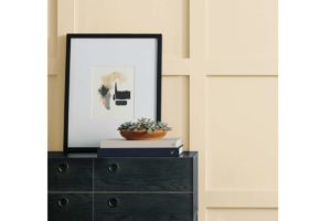
A lighter hue that is sure to add cozy comfort to your space is Practical Beige. This color would look gorgeous in a bedroom. As a very serene color it could also easily work elsewhere in a home quite effortlessly. This color is grounding and comforting. If your current interior design incorporates a lot of vibrant colors and eclectic pieces, Practical Beige can help to create an ease and flow between these elements.
Sherwin Williams Practical Beige
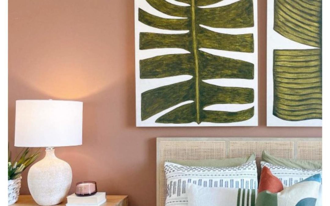
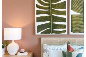
Lastly, to invigorate your interior, opt for the gorgeous Canyon Clay for a nice kick of spice. I can see this being a wonderful accent pop on cabinets or a singular wall in a living space. I’ve also seen it used on interior stair steps, which is an unusual, but extraordinarily pretty decision for the right space. Evoking a luxurious bohemian feel, Canyon Clay is a sophisticated dark hue.
Inviting, Tranquil Greens
Greens are a wonderful way to add warmth and vibrancy to a space. The color green transports us into more natural elements and has been all the rage for recent trends in interior design. It is an interesting way to add a welcoming feeling to your atmosphere without using yellow or red, which we typically associate with that sentiment. Escape Gray is a light gray with green undertones that feels airy, calming, and fresh.
This color can feel harmonious in many spaces around a home. Consider it for a bedroom or a relaxed accent wall in the living room. This color really has the ability to look lovely in many different areas of your interior. Incorporating it into a bathroom or powder room is a clear option that could work really well too.
Sherwin Williams Escape Gray
On the opposite end of the green spectrum you will find the moody green, Underseas. This particular hue has a bit of blue in its undertones as well, which gives it a rich, sophisticated shade. If you want to bring more depth to your dining room, consider Underseas as a unique way to accent the space. Dark dramatics inside the home have been popping up more frequently so using this color on your kitchen cabinets or even in a small area like a half bathroom can make a big impact. Similarly to Canyon Clay, a stair accent could be gorgeous with this darker hue as well!
Sitting in the middle of these two hues is Mineral Deposit. Another gorgeous blue-green for a kitchen or dining room, this particular shade is a mid-tone. As a mid-tone, this color is easier to coordinate and function in various lighting environments than the previous dark hue, Underseas.
Blue is also a popular color for bathrooms, and although Mineral Deposit has more going on in its undertones, it is a great hue to add a little oomph to those spaces while still being a relaxing tone.
Reserved Yellows With Brown Undertones
Yellow can certainly be a polarizing color, but it does have the ability to be relaxing and harmonious despite its reputation of being a bright and sometimes agitating hue.Take Echelon Ecru for example, this soft yellow has hints of tan to bring down the saturation. This color is a great option for adding some zest and energy to an entryway or kitchen accent without being overwhelming. This color and the following options would also look stunning with darker wood furniture or cabinets.
Sherwin Williams Echelon Ecru
Tumblin’ Tumbleweed is a step darker from Echelon Ecru, but still incorporates enough white in its undertones to steer clear from the associations yellow tends to have. This color would be a great, energizing option for a sitting room. It is invigorating and is sure to uplift the spirits of those that experience it.
For a more saturated hue, go for Harmonic Tan. Although it does have a richer base than the other colors discussed here, it is still soft enough to use beyond an accent. It can be very comforting in a larger space like a living room or could work well in a smaller bathroom or nook. Overall, these yellows are in the boho family, which is why they work so well to create unique pops of color without being jarring.
Happy Color Journey!
I hope you are feeling inspired to think outside the box! Check out these colors in your own space to add a unique touch to your home. Opt for a “Color To Go” jug of paint or a peel-and-stick sample to be able to accurately view and visualize the color throughout the day as the lighting changes in your space. For neutral pairings to these colors read on here:blog about whites?
If you are still needing help choosing your colors, our Certified Color Designers are here to help! Schedule a color consultation today to find the perfect color for your interior or exterior.