5 HRCA Color Schemes To Get Excited About
Color selection for an exterior paint job can be intimidating, especially when there is an additional layer of appeasing your Homeowners Association. This doesn’t mean you can’t have the transformation of your dreams though! This article will cover five of our favorite Highlands Ranch color schemes, but feel free to use these for your own Homeowners Association as they are all HOA friendly.
If you find yourself struggling to nail down the perfect color scheme to submit to your HOA you can always reach out to our team of Color Designers for a Color Consultation! Our Certified Color Consultants are the best in the biz! They’ll help walk you through different color options, provide you with color samples, professional mockups and leave you feeling confident in your color decisions.
Option #1: Grizzle Gray, Snowbound & Gray Matters

Opting for a rich dark charcoal like Grizzle Gray paired with a crisp, cool white like Snowbound allows for a transformation that feels modern but timeless. The coolness in Grizzle Gray is balanced by the gray and green tones and overall create a hue that is both sophisticated and bold. Gray Matters is a mid-tone sitting between Grizzle and Snowbound to offer an accent that feels united and harmonious. If your fixed features are in the same family, for example a roof or stonework that has tinges of blue, Grizzle Gray, Snowbound, and Gray Matters will certainly feel cohesive and fresh with those elements.
Option #2: Sensible Hue, Roman Column & Cornwall Slate

Sensible Hue is a gorgeous warm green gray option that certainly feels along the lines of the trendy earth tones we are seeing forecasted for this year. For trim, opt for a white on the warmer end of the spectrum like Roman Column. To accent, Cornwall Slate brings a saturated version of a green-gray to the scheme and overall adds a sophisticated pop. Together these hues evoke an earthy and inviting atmosphere. A great option too if you are working around cooler toned roofing or brick features.
Option #3: Westhighland White, Loggia & Foothills
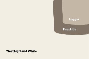
You can’t get more classic than a white house. Westhighland White is a gorgeous warm white that feels bright but also very welcoming. The yellow undertones in Westhighland White paired with a chocolate brown hue like Foothills on the trim lends for a timeless look. Seal the deal with Loggia as an accent and you have yourself a winning and lasting look to your home that will transcend trends. Extra points if you have stonework or brick on your home with warmer red notes, these colors will flow harmoniously.
Option #4: Colonnade Gray, Extra White & Pavestone
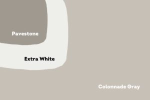
Another pair to consider if you are working with warmer fixed features is Colonnade Gray and Extra White. Colonnade Gray is a greige color having slight brown undertones. Pairing this color with a classic Extra White on the trim elevates the look of the scheme and balances those warmer tones with a crisp trim. As a final touch, use Pavestone to create a dark and dramatic accent amidst your lighter body and trim colors.
Option #5: Functional Gray, Drift of Mist & Mindful Gray
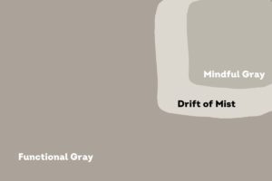
Functional Gray is a darker greige option giving more saturation and depth compared to Colonnade gray. For a slightly different trim option, Drift of Mist is a light gray option that still has warm undertones pairing gorgeously with Functional Gray. Drift of Mist will likely appear very close to white in most lighting situations. If you are also looking to go in a different direction with an accent, Mindful Gray feels in between Functional Gray and Drift of Mist for a subdued, neutral feature.
To Sum Up
Remember, thinking about neutral and grounding colors is key here. Observing those fixed features or elements of your exterior that will be staying put is very important in the color decision process. This will ensure that there is cohesiveness to your exterior. Driving around your neighborhood for inspiration can be helpful, keeping in mind that your HOA will typically deny colors that are too similar to the houses directly across the street from you or to the left and right of your home.
I hope you feel inspired and ready to transform your home! If you’d like a color consultation, or if you are ready to get pricing for you paint project, you can submit for an estimate HERE.