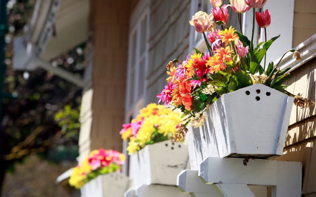
by Corey Morgan | Apr 7, 2023 | Interior Painting, Paint Color Help, Popular Colors
5 Bathroom Paint Colors for Dark, Moody Bathrooms
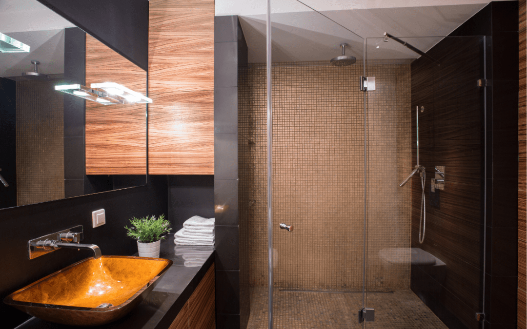
There’s just something fun about using dark paint colors to create a moody and dramatic space. They’re versatile in the sense that you can use a little to create a focal point or a lot to create an overall effect. Either way, dark, theatrical colors are a huge paint color trend for 2023. Bathrooms happen to be a great way to try out this trend without overcommitting. Keep reading to learn about our top 5 bathroom paint colors to try for dark, moody bathrooms in 2023.
Urbane Bronze
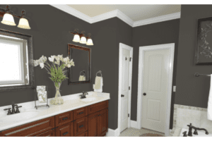
Urbane Bronze is an incredible combination of black, gray, and brown. It’s beautiful on both exteriors and interiors and it’s a great way to ease into the dark paint color trend we’re seeing this year. It’s a very grounded color and pairs well with neutrals like tan or greige colors so it’s great for creating a sophisticated and tranquil space. For the largest impact, consider using Urbane Bronze on your bathroom walls, trim, and ceilings to create a cozy feeling that you’ll love spending time in.
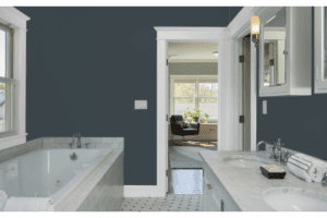
Hale Navy HC-154
If you’re not quite ready to dive into the super dark paint colors, but you want to give this trend a try, check out Hale Navy. It’s a classic color from Benjamin Moore that has a huge fanbase. It’s a bit more modern than some traditional navy blues because it features a slightly gray undertone. The gray undertone really helps to ground the paint color. Hale Navy is beautiful on cabinets or walls and pairs really well with white trim for that crisp, clean contrast.
Greenblack 6994
For our bravest souls that love trying a new paint color trend we have Greenblack. This color is not subtle and is sure to bring that wow factor to your bathroom. The base is a cool black with a slightly green undertone and it works exceptionally well on walls and cabinetry. If it feels a little intense, consider doing just your cabinets or an accent wall to draw the eye and create a statement. When going with a black paint color, try to look for one that has some kind of undertone rather than a classic black because those undertones add a lot of personality and help the color feel much more dynamic within your space.
Dark Purple 2073-10
Some clients are really looking for a moody vibe that still feels romantic and inviting. Dark Purple from Benjamin Moore checks all of the boxes with a rich plum tone that brings a hint of mystery and glamour to any space. We love this for a bathroom because it’s not a color you see all of the time, so it will definitely stand out. This bathroom paint color pairs really well with white, black, or even tan countertops. So grab a sample and see if you feel like it works within your space.
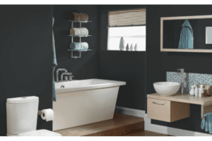
Mount Etna 7625
Blue is the most commonly requested color our designers receive, so we had to include a couple blue options. Mount Etna from Sherwin Williams is sure to stun with it’s slate gray base and subtle green undertones. It’s a very interesting and universally appealing color. Try this as an allover color or create a statement piece by painting your bathroom cabinets in this dramatic and moody paint color.
Painter for a Day
Bathrooms are a great way to test this paint color trend out because they’re small and often closed off from other spaces. So they are great for a unique color scheme without creating a lack of harmony with the rest of the house. However, it can be difficult to find a professional interior painter to help tackle a project this small. Most companies prioritize larger projects where they can make more money.
Here at Kind Home Painting Co. we’re committed to helping as many homeowners as possible to create the home and space they’ve been dreaming of. Since we understand how difficult it can be to find a painter for smaller paint projects we created our Painter for a Day program. This program offers straightforward, flat-rate pricing and a one-year warranty on all small painting projects. You can also add on a professional color consultation with a color designer to help you land on the perfect deep paint color that provides the impact you’re looking for. Use this link to request a complimentary estimate and get your project started today!
by Corey Morgan | Mar 28, 2023 | Interior Painting
How Much Does Interior Painting Cost In Colorado?
It’s that time of year in Colorado when everyone starts planning their home improvement projects for the year.
If one of those projects is painting the interior of your home, one of the biggest questions you may have is, how much does interior painting cost in Colorado? And it’s a great question to ask!
In this blog we will discuss and breakdown the different factors that can affect how much it costs to paint your interior in Colorado and dig into some average job sizes based on our painting services.
How Much Does Interior Painting Cost Per Square Foot?
Most everyone starts in the same place— how many square feet is my home and how much per square foot will it cost to paint? The size of your home absolutely plays a large role in how much it will cost to paint your interior.
If you have a bigger home it will obviously cost more to paint, and if your home is smaller it will cost less to paint. The items that are getting painted is also an important factor to consider. If you’re painting the walls only, that will be less expensive than painting the walls, ceilings, trim and doors.
Another factor to consider is the overall scope of work—what specific areas and how much surface area of the walls, ceilings, trim and doors of the space you are looking to paint? These are the main drivers in the overall cost.
What we’ve found is this can vary from client to client based on their wants and needs. It can also vary home to home based on the design and layout of the specific home. Modern homes with an open floor plan have fewer walls by the nature of their design, while older homes (with each room and area being closed off) can have more wall surface area by the nature of their design.
Knowing the square footage of a home can help to give an idea of the cost range for interior painting; however, there are many more factors to consider to determine an accurate cost for each home.
What Goes Into Figuring Material & Labor Costs?
When we look at estimating the price to paint an interior, there are many variables and factors that go into working up that price. The two main factors are materials and labor.
- How many gallons of primer and paint are required?
- How many days will it take to complete the work?
The amount of paint required is fairly simple to determine. You take the square footage of the surface area of walls, ceilings, trim & doors you intend to paint and divide it by the specified square foot coverage of the paint product you are using.
For example, if the paint you use specifies that a gallon can cover 250-350 Square feet of surface area and you have 6000 square feet of walls and ceilings to paint, you would divide 6000/250 to get (24) gallons of paint. We always recommend utilizing the lower end of paint coverage specification to ensure full coverage, especially when changing colors.
How many days it will take really depends on how complicated the actual painting is. If there are several areas with 2nd story or 3rd story walls, that can take more time to paint than a ranch style home with single story walls throughout.
Whether the home is in great shape or if it has extensive repair work that needs to be completed prior to painting can influence the final cost as well. Repairs create the need for more materials and more labor.
What Other Factors Can Increase the Cost of My Interior Paint Project?
Now that we have a working understanding of some main factors let’s dig into some smaller details.
There are many items to paint in a home, some of them can be more labor intensive than others and require specialty materials for lasting durability.
If you want to paint wood that is currently stained, like kitchen cabinets, stair railings or doors and trim, the cost of your project will increase significantly. To properly paint these items and achieve a long lasting aesthetically pleasing finish, you must follow specific processes and utilize specific material.
Let’s talk about cabinet painting!
- First, painters will disassemble cabinets and thoroughly protect the work area, next they will rinse down cabinets with lacquer thinner and wipe them dry.
- The next step would be to sand everything and then fully prime them with specialty primer.
- After the primer coat has dried it’s time for a quick buff with sandpaper and then on to the first coat of paint. Once that has dried, a second top coat is applied.
With all of that labor and the cost of the specialty products used to paint cabinets, the price increase adds up. If you decide to paint your cabinets along with the interior of your home it can add anywhere from $3,000-$8,000+ to your project depending on how many cabinets you have in your home.
Will It Cost More To Use Higher Quality Materials?
Another element to consider is the quality of paint being used on the project. Some companies use lower quality paint and others use higher quality paint. There can be a difference of up to $50 per gallon between different paints. When you use 20-40 gallons to paint the interior of a home that cost adds up quickly!
We always recommend using high quality paint and materials so you get a better return on your investment. Higher quality paint looks better and lasts longer, it resists damage due to moisture and wear and tear better, it is easier to clean and maintain AND touch-ups are easier to perform and look better.
What’s The Average Interior Cost to Paint In Colorado?
Here at Kind Home Painting Company in Denver, Colorado we painted over 250 home interiors in 2022. The pricing ranged from $2,500-$40,000 for interior painting and the average project price was $7,699.
As you can see there is a large range of pricing associated with painting the interior of a home. To get an accurate idea of how much it may cost to paint your specific home, we always recommend getting an estimate from a qualified painting company.
If you’d like to learn more about our specific painting processes you can visit our Youtube page or if you’d like to schedule a Denver interior painting estimate to learn what it will cost for your project you can do so HERE.
by Corey Morgan | Mar 14, 2023 | Exterior Painting
Why Spring is the Best Time to Paint Your Exterior
Exterior Painting in Spring
Spring marks the start of the exterior painting season for Denver painters. That means it might be time to check out your exterior paint and see what kind of projects you’ll need to prioritize this year. Your exterior paint is important because it’s the first layer of defense when it comes to maintaining your home. Exterior paint protects your siding and has a huge impact on the overall appearance of your home. There are a lot of great times to paint your exterior in Colorado but spring is one of the best times to paint your home.
Mild Temperatures
As weather shifts into spring mode, Denver weather becomes much more mild, which makes it ideal for exterior painting. You don’t want it to be too cold or too hot when you paint an exterior, which is why spring has some of the best weather you can ask for. Spring projects may take a little longer due to shorter days, a single day project in the summer may take two to three days to complete, but this is easily accommodated.
Of course early spring can be a little tricky with weather because you never know if it will be snowing, sunny, or both! The way that we prepare for this as a company is we don’t fill our March calendar to full capacity. By not scheduling to capacity our paint teams and project managers are less likely to become overwhelmed with backed up wor. This allows them to reschedule more fluidly and accommodate our spring clients.
More One-on-One Attention
Fewer projects means your Project Manager will have even more time for you and your project. As the season picks up most paint companies will become quite busy and team members will be operating at a higher capacity. Our systems are set up to ensure that clients are always well taken care of. Spring painting does have some obvious extra benefits though.

As we’ve already mentioned, projects do take a little bit longer this time of year, which means you’ll have a bit more time with your project manager. This also gives you more time to inspect the work and make sure you’re fully satisfied with everything. Kind Home Painting Co. has a unique 100% satisfaction guarantee which means you don’t pay a penny until your project is complete and you are happy with the work!
Best Exterior Paint Pricing
This might be the most appealing benefit of painting your exterior in the spring because you are much more likely to get the best deals of the season. Summer and fall are notoriously very busy for most painters but the spring can be a slower start to the year, especially when it comes to exterior work. We’re always eager to get our best teams back to work after a long winter, so we’re happy to repay you for your assistance by offering the best discounts of the year.
Keep in mind that spring spots are super limited and once they’re filled most painters won’t continue to offer those steep spring painting discounts. We always advise that you get your estimates as early as possible. January, February and March are some of the best times to capitalize on spring pricing, so it’s recommended to start reaching out to companies as soon as possible. We honor our undiscounted pricing all season and we’re always willing to work with you at any point if the spring isn’t the best time for your paint project. However, over the years we’ve found that most of our clients are thrilled to have the extra discount!
Easier HOA Color Approval
Choosing colors is one of the biggest challenges to painting the exterior of your home, but obtaining HOA approval can be even harder. By starting the exterior painting process early in the year you really give yourself more time to select colors you’ll love and make sure you have time to get them approved by your HOA. Homeowners Associations generally deal with far fewer submissions for color approval in the spring, unlike during the summer when they get a higher rate of submissions. This means you’re much more likely to hear back from your HOA sooner. This can be especially beneficial for clients who are part of HOAs that only meet every sixty days.
Paint Your Exterior in the Spring
The summer and fall are always options for painting your exterior, but spring painting does bring with it quite a few benefits. Additional savings, more time for HOA approval, milder weather, and a more personalized customer service experience can make all the difference. If your exterior looks like it could use some TLC we recommend starting the paint process with a free estimate to get a better idea of your project scope and pricing. Ask about our spring specials for this year’s best pricing!
by Corey Morgan | Feb 24, 2023 | Paint Color Help
5 HRCA Color Schemes To Get Excited About
Color selection for an exterior paint job can be intimidating, especially when there is an additional layer of appeasing your Homeowners Association. This doesn’t mean you can’t have the transformation of your dreams though! This article will cover five of our favorite Highlands Ranch color schemes, but feel free to use these for your own Homeowners Association as they are all HOA friendly.
If you find yourself struggling to nail down the perfect color scheme to submit to your HOA you can always reach out to our team of Color Designers for a Color Consultation! Our Certified Color Consultants are the best in the biz! They’ll help walk you through different color options, provide you with color samples, professional mockups and leave you feeling confident in your color decisions.
Option #1: Grizzle Gray, Snowbound & Gray Matters

Opting for a rich dark charcoal like Grizzle Gray paired with a crisp, cool white like Snowbound allows for a transformation that feels modern but timeless. The coolness in Grizzle Gray is balanced by the gray and green tones and overall create a hue that is both sophisticated and bold. Gray Matters is a mid-tone sitting between Grizzle and Snowbound to offer an accent that feels united and harmonious. If your fixed features are in the same family, for example a roof or stonework that has tinges of blue, Grizzle Gray, Snowbound, and Gray Matters will certainly feel cohesive and fresh with those elements.
Option #2: Sensible Hue, Roman Column & Cornwall Slate

Sensible Hue is a gorgeous warm green gray option that certainly feels along the lines of the trendy earth tones we are seeing forecasted for this year. For trim, opt for a white on the warmer end of the spectrum like Roman Column. To accent, Cornwall Slate brings a saturated version of a green-gray to the scheme and overall adds a sophisticated pop. Together these hues evoke an earthy and inviting atmosphere. A great option too if you are working around cooler toned roofing or brick features.
Option #3: Westhighland White, Loggia & Foothills

You can’t get more classic than a white house. Westhighland White is a gorgeous warm white that feels bright but also very welcoming. The yellow undertones in Westhighland White paired with a chocolate brown hue like Foothills on the trim lends for a timeless look. Seal the deal with Loggia as an accent and you have yourself a winning and lasting look to your home that will transcend trends. Extra points if you have stonework or brick on your home with warmer red notes, these colors will flow harmoniously.
Option #4: Colonnade Gray, Extra White & Pavestone

Another pair to consider if you are working with warmer fixed features is Colonnade Gray and Extra White. Colonnade Gray is a greige color having slight brown undertones. Pairing this color with a classic Extra White on the trim elevates the look of the scheme and balances those warmer tones with a crisp trim. As a final touch, use Pavestone to create a dark and dramatic accent amidst your lighter body and trim colors.
Option #5: Functional Gray, Drift of Mist & Mindful Gray
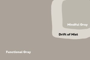
Functional Gray is a darker greige option giving more saturation and depth compared to Colonnade gray. For a slightly different trim option, Drift of Mist is a light gray option that still has warm undertones pairing gorgeously with Functional Gray. Drift of Mist will likely appear very close to white in most lighting situations. If you are also looking to go in a different direction with an accent, Mindful Gray feels in between Functional Gray and Drift of Mist for a subdued, neutral feature.
To Sum Up
Remember, thinking about neutral and grounding colors is key here. Observing those fixed features or elements of your exterior that will be staying put is very important in the color decision process. This will ensure that there is cohesiveness to your exterior. Driving around your neighborhood for inspiration can be helpful, keeping in mind that your HOA will typically deny colors that are too similar to the houses directly across the street from you or to the left and right of your home.
I hope you feel inspired and ready to transform your home! If you’d like a color consultation, or if you are ready to get pricing for you paint project, you can submit for an estimate HERE.
by Corey Morgan | Feb 18, 2023 | Interior Painting
Warm Interior Colors From Sherwin Williams
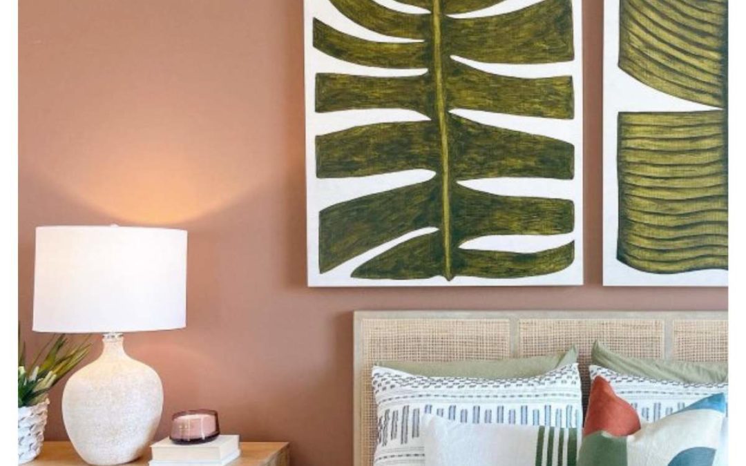
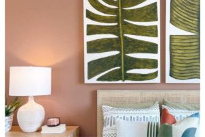
When it comes to interior paint, people tend to play it safe with neutral choices in the white and gray family. However, predictions for this year include a shift towards earth tones with major brands like Sherwin Williams and Benjamin Moore highlighting quite vivid colors and hues reminiscent of nature.
Though their respective Colors of the Year may not be for everyone (you should take a look for yourself before you write them off!) I can clearly envision more saturated hues on the warmer end of the spectrum being attractive to interior projects this year. I encourage you to branch out and consider these more unconventional colors to bring more personality into your home!
Sherwin Williams Red-Browns From The Desert Landscape
This year, Sherwin Williams named Redend Point their Color of the Year. What you most likely first notice in this color is its flesh toned qualities bridging on a pottery-esque feeling. I think their direction is interesting with this choice, but I would opt for colors in this family with more pigment like Moroccan Spice.
Sherwin Williams Moroccan Spice
A much darker brown with warm red undertones makes it easier to pair with wood furniture and darker decor that we often see in interior spaces. This earth tone feels much closer to a terracotta, but lacks a bit of orange you would normally see. I can see this rich hue working beautifully in an office or living room nook. I would use caution when considering it for a large-scale project, however, if your space receives a lot of natural light, it could look absolutely stunning.
A lighter hue that is sure to add cozy comfort to your space is Practical Beige. This color would look gorgeous in a bedroom. As a very serene color it could also easily work elsewhere in a home quite effortlessly. This color is grounding and comforting. If your current interior design incorporates a lot of vibrant colors and eclectic pieces, Practical Beige can help to create an ease and flow between these elements.
Sherwin Williams Practical Beige
Lastly, to invigorate your interior, opt for the gorgeous Canyon Clay for a nice kick of spice. I can see this being a wonderful accent pop on cabinets or a singular wall in a living space. I’ve also seen it used on interior stair steps, which is an unusual, but extraordinarily pretty decision for the right space. Evoking a luxurious bohemian feel, Canyon Clay is a sophisticated dark hue.
Inviting, Tranquil Greens
Greens are a wonderful way to add warmth and vibrancy to a space. The color green transports us into more natural elements and has been all the rage for recent trends in interior design. It is an interesting way to add a welcoming feeling to your atmosphere without using yellow or red, which we typically associate with that sentiment. Escape Gray is a light gray with green undertones that feels airy, calming, and fresh.
This color can feel harmonious in many spaces around a home. Consider it for a bedroom or a relaxed accent wall in the living room. This color really has the ability to look lovely in many different areas of your interior. Incorporating it into a bathroom or powder room is a clear option that could work really well too.
Sherwin Williams Escape Gray
On the opposite end of the green spectrum you will find the moody green, Underseas. This particular hue has a bit of blue in its undertones as well, which gives it a rich, sophisticated shade. If you want to bring more depth to your dining room, consider Underseas as a unique way to accent the space. Dark dramatics inside the home have been popping up more frequently so using this color on your kitchen cabinets or even in a small area like a half bathroom can make a big impact. Similarly to Canyon Clay, a stair accent could be gorgeous with this darker hue as well!
Sitting in the middle of these two hues is Mineral Deposit. Another gorgeous blue-green for a kitchen or dining room, this particular shade is a mid-tone. As a mid-tone, this color is easier to coordinate and function in various lighting environments than the previous dark hue, Underseas.
Blue is also a popular color for bathrooms, and although Mineral Deposit has more going on in its undertones, it is a great hue to add a little oomph to those spaces while still being a relaxing tone.
Reserved Yellows With Brown Undertones
Yellow can certainly be a polarizing color, but it does have the ability to be relaxing and harmonious despite its reputation of being a bright and sometimes agitating hue.Take Echelon Ecru for example, this soft yellow has hints of tan to bring down the saturation. This color is a great option for adding some zest and energy to an entryway or kitchen accent without being overwhelming. This color and the following options would also look stunning with darker wood furniture or cabinets.
Sherwin Williams Echelon Ecru
Tumblin’ Tumbleweed is a step darker from Echelon Ecru, but still incorporates enough white in its undertones to steer clear from the associations yellow tends to have. This color would be a great, energizing option for a sitting room. It is invigorating and is sure to uplift the spirits of those that experience it.
For a more saturated hue, go for Harmonic Tan. Although it does have a richer base than the other colors discussed here, it is still soft enough to use beyond an accent. It can be very comforting in a larger space like a living room or could work well in a smaller bathroom or nook. Overall, these yellows are in the boho family, which is why they work so well to create unique pops of color without being jarring.
Happy Color Journey!
I hope you are feeling inspired to think outside the box! Check out these colors in your own space to add a unique touch to your home. Opt for a “Color To Go” jug of paint or a peel-and-stick sample to be able to accurately view and visualize the color throughout the day as the lighting changes in your space. For neutral pairings to these colors read on here:blog about whites?
If you are still needing help choosing your colors, our Certified Color Designers are here to help! Schedule a color consultation today to find the perfect color for your interior or exterior.